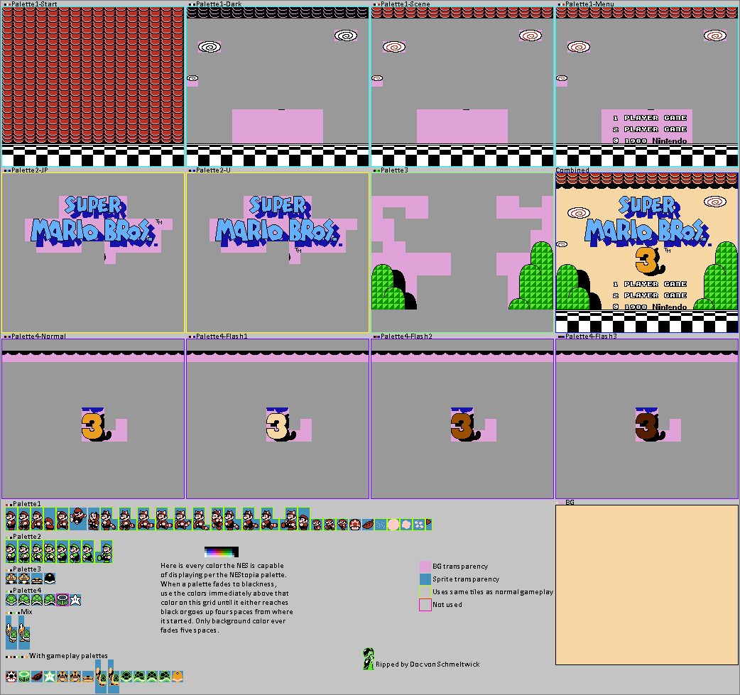
Title Screen
(Current scale is below 100% - zoom in to view full detail.)
| Asset Info favorite | |
|---|---|
| Name | Title Screen |
| Category | NES |
| Game | Super Mario Bros. 3 |
| Section | Other Backgrounds |
| Submitted | A long, long time ago |
| Uploaded By | Doc von Schmeltwick |
| Additional Credits | Zephiel87 |
| Size | 64.43 KB (1042x979) |
| Format | PNG (image/png) |
| Hits | 54,179 |
Animated GIFs (0)
Comments (7)

@Cascade It’s the font shape that I don’t like, not the color

@Jod Dan The NES probably didn't have enough graphical power to display the now iconic 4 color logo.
Revision sent: Complete re-rip from the ground up. Includes sprites and several other information, and uses higher quality NEStopia palette.
The blue font looks HORRIBLE!
@MadeKillaSam It may have something to do with the CHR data for Mario's "looking up" sprite not being loaded anywhere else, most likely to save RAM space for the various enemies in each stage.
I could be wrong, but that's probably what it is.
I could be wrong, but that's probably what it is.

how can mario look up on the title screen but not anywhere else?

The trademark sign in the Japanese/SNES version is after the "Bros." text. In the English version, the trademark sign is after the number "3"
You must be logged in to post comments.