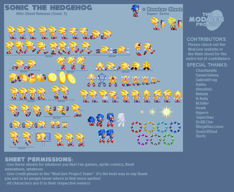
Super Sonic
(Current scale is below 100% - zoom in to view full detail.)
| Asset Info favorite | |
|---|---|
| Name | Super Sonic |
| Category | Custom / Edited |
| Game | Sonic the Hedgehog Customs |
| Section | Sonic the Hedgehog |
| Submitted | September 27, 2015 |
| Uploaded By | Xeric |
| Additional Credits | Mod. Gen Project Team |
| Size | 75.32 KB (747x615) |
| Format | PNG (image/png) |
| Hits | 88,111 |
Animated GIFs (0)
Comments (10)
the style here looks awesome love how they upped the saturation on the gloves to be more blue its a great contrast to the bright yellow
Make Kirby next! Or even Mega Man!
Love to see those since not much happens.
Love to see those since not much happens.

@You Gotta be Joshing me : I mean, the S2 and S3&K had 3 head positions
Same as stand -> transitioning to look directly straight -> look directly straight -> transitioning to look directly straight : loop
but this only has the two, just like S1, but it only had 6 frames of walk, unlike this which has 8, making it look weird
and the default head unedited ((so if it is in animation like walk or it is edited like in idle, doesnt count)) in 8 out of the 24 or 25 animations, not including the one that uses it, but as it switch to different
@Alzter : The only reason why that is like that is because they use the S1 sprite for normal, but for super they use the S2 sprite, which has more frame of animation

@UnknownEXE Hey, the same could be said for most of the Genesis sprites anyways. Pretty much all of the Genesis games recycled the same 3-4 different head positions for most of the sprites.
tbh this was just a lazy creation, not saying the sprites are bad or anything, but like the same head is used for like everything

Why does Super Sonic have more walk frames than normal sonic? I really don't get why in some Sonic Hacks/Fan-games regular Sonic has 5 walk frames but Super Sonic has 8. Sonic 1 2013 doesn't have this problem, take a look: https://www.spriters-resource.com/mobile/sonicthehedgehog/sheet/63938/
@Somari64: Even S3K had different head positions for animations such as running and pushing, which is not the case for this sheet. Their approach hardly resembles what was done for S3K to begin with.
There is nothing stopping them from actually making each animation look at least slightly more different, it's just that they're sincerely happy with just reusing the same head for nearly everything in here. And when they actually make a different head angle for the walking animation, it looks inconsistent with the rest of the sheet. It sincerely looks way too off and lifeless for most of the part.
There is nothing stopping them from actually making each animation look at least slightly more different, it's just that they're sincerely happy with just reusing the same head for nearly everything in here. And when they actually make a different head angle for the walking animation, it looks inconsistent with the rest of the sheet. It sincerely looks way too off and lifeless for most of the part.

@MotorRoach: While I agree that the transformation animation looks a tad awkward, I have to disagree with most of the points you brought up in your comment. Normal Sonic does have different head angles for certain animations, but Super Sonic does not. In actuality, a majority of Super Sonic's animations in this sheet are very accurate to his animations in Sonic 2 and 3&K. As for the skidding, the original frames in that particular skidding animation used the standard standing head for both Sonic and Super Sonic. The Sonic 1 victorious jumping and ending sequence animations were not seen in Sonic 3&K, but if they had been, Sonic's head would be positioned in the exact same manner as it is here. I say this because the team was going for a more Sonic 3&K approach with both the art style and animations.
Well damn, these are pretty sweet.
The sprite design itself is pretty nice, but what makes it a bit hard for me to like this further is the fact that he's using the same head position for too many things. To be specific, the standing head seems to be used for pushing, standing on the edge, the ending animation sequence, skidding, and the victorious looking jump at the bottom left. Having played the original games myself, I can easily tell that there was more variation in his head angles, and the animations felt more expressive in those, although in here, everything feels awfully stiff, and the only variation there is between the animations I've mentioned is that his easy are a little angrier, and he just moves his eye pupil down instead of actually angling his head down-- that's pretty much it.
Also, for the transformation animation, the second sprite seems to be a tad shadeless at the head, and the third sprite.... just has a really awkward face expression. It doesn't looks like something that he would normally do when opening his mouth at all, and I don't get the vibe that he's releasing the power kept inside him or anything like that-- I get more the vibe that he looked up and got mildly impressed by something. The transformation variation on the bottom seems a tad better, but he also doesn't seems to be giving much of a damn about transforming, given that he's looking way too calm-- just taking his Sonic Battle healing pose and giving him floating feet does not works that easily in here. I strongly recommend that you keep his mouth centered (and make it bigger), and try to make his eyes seem angrier in both variations.
Also, for the transformation animation, the second sprite seems to be a tad shadeless at the head, and the third sprite.... just has a really awkward face expression. It doesn't looks like something that he would normally do when opening his mouth at all, and I don't get the vibe that he's releasing the power kept inside him or anything like that-- I get more the vibe that he looked up and got mildly impressed by something. The transformation variation on the bottom seems a tad better, but he also doesn't seems to be giving much of a damn about transforming, given that he's looking way too calm-- just taking his Sonic Battle healing pose and giving him floating feet does not works that easily in here. I strongly recommend that you keep his mouth centered (and make it bigger), and try to make his eyes seem angrier in both variations.
You must be logged in to post comments.