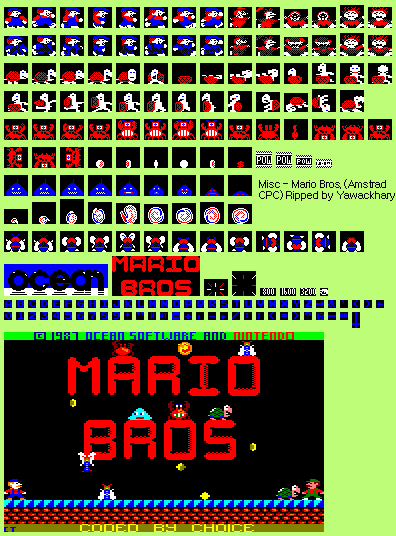
Mario, Enemies and Miscellaneous
(Current scale is below 100% - zoom in to view full detail.)
| Asset Info favorite | |
|---|---|
| Name | Mario, Enemies and Miscellaneous |
| Category | Amstrad CPC |
| Game | Mario Bros. |
| Section | Miscellaneous |
| Submitted | January 3, 2018 |
| Uploaded By | Yawackhary |
| Size | 8.83 KB (396x536) |
| Format | PNG (image/png) |
| Hits | 7,800 |
Animated GIFs (0)
Comments (10)
the title screen looks like something a 7 year old would draw in microsoft paint

That freezie looks like a damn slime
what the heck?
HEY!! I remember seeing this game's port years back on Let's Compare, and joking at how ugly it looked. Since then I wanted a sheet of it to truly see how bad it looked, and now heheh, after all those years, I guess I finally got what I wanted! Thanks, Yawackhary!

@Snessy the Duck
It's does look very ugly compared to other Amstrad CPC game.
It's does look very ugly compared to other Amstrad CPC game.

Dear god these graphics are fucking terrible.
Freezie/Slipice looks like the Slimes in Dragon Quest/Warrior...
@Superjustinbros: Sadly no. The game was a rushed Speccy port with some slight touch ups and did the old title screen has better art than the game trick. I was equally disappointed too when ripping it and yes, even checked the tiles before confirming that's it. In fact "Luigi" in this game is actually the exact same sprite as Mario from the Spectrum version!
Is there by chance two different graphic modes, with the second being the sprites that appear on the title screen?

The Title Screen Mario and Luigi look much more accurate than the In-Game ones.
You must be logged in to post comments.